

Aim your fixture at roughly a 30-degree angle from the wall, use a warm LED between 2700K and 3000K, and pick a bulb with a CRI of 90 or higher. Add a dimmer, keep sensitive prints and works on paper away from direct sun, and dial back brightness on anything valuable or light-sensitive. Get those five variables right and almost any painting, print, or sculpture looks gallery-lit.
TL;DR:
- Use adjustable fixtures with at least 30 degrees of rotation and narrow to medium beam spreads for flexibility, especially with rotating or growing collections.
- Maintain a color temperature between 2700K and 3000K with a CRI of 90 or higher to ensure accurate and flattering displays of artwork.
- Position lighting approximately one-third of ceiling height from the wall and aim at about 30 degrees to minimize glare and harsh shadows.
- Prioritize LED lights for less heat and UV emission, and always match the color temperature and CRI across multiple fixtures in the same room.
- Keep sensitive works on paper or textiles in lower lux levels around 50 lux, with UV-filtering measures, to prevent irreversible fading and damage.
Table of Contents
- The Numeric Rules Behind How to Light Art Correctly
- Which Fixture Type Actually Fits Your Wall?
- Where Exactly Should the Light Go?
- How Glass, Varnish, and Texture Change Your Lighting Plan
- What Are the Real Conservation and Safety Limits?
- Setting Up and Tuning Your Lights Step by Step
- Ambient, Accent, and Task Lighting: What Each One Does for Art
- Using Multiple Light Sources for Depth
- Managing Natural Light Around Displayed Art
- Lighting Paintings, Sculptures, Textiles, and Photographs Differently
- The Mistakes That Ruin an Otherwise Good Lighting Setup
- How This Applies to Devotional and Saint Prints
- Divineprints Makes It Easy to Put That Lighting Plan to Use
- Sources
- FAQ
The Numeric Rules Behind How to Light Art Correctly
Every good art lighting setup rests on three numbers: angle, color temperature, and CRI. Get these wrong and no amount of expensive fixtures will save the display.
The 30-degree rule comes straight from museum practice. Mount or aim your light so the beam hits the artwork at about a 30-degree angle from vertical, and you avoid the double problem of glare bouncing back at the viewer and harsh shadows from frame edges. Architectural Digest’s lighting guidance treats this angle as the starting point for nearly every fixture type, from ceiling accents to track heads.
Color temperature matters just as much as angle. A range of 2700K to 3000K reads as warm white, close to candlelight or an incandescent bulb, and it flatters skin tones, wood frames, and the warm pigments common in oil paintings. Christie’s own lighting guide recommends settling near 2700K specifically because it keeps colors looking natural rather than clinical.
Then there’s CRI, or Color Rendering Index, which measures how accurately a light source reveals true color compared to natural daylight. A bulb with:
- CRI 80 to 89: acceptable for hallways, not for art
- CRI 90 to 94: the practical minimum for displaying artwork
- CRI 95 and above: museum-quality color accuracy, per Christie’s recommendation
Sensitive works on paper need far less light overall, a point that conservation sections below will cover in more depth.
Which Fixture Type Actually Fits Your Wall?
Choosing a fixture comes down to how often your display changes and how much control you want over each piece.
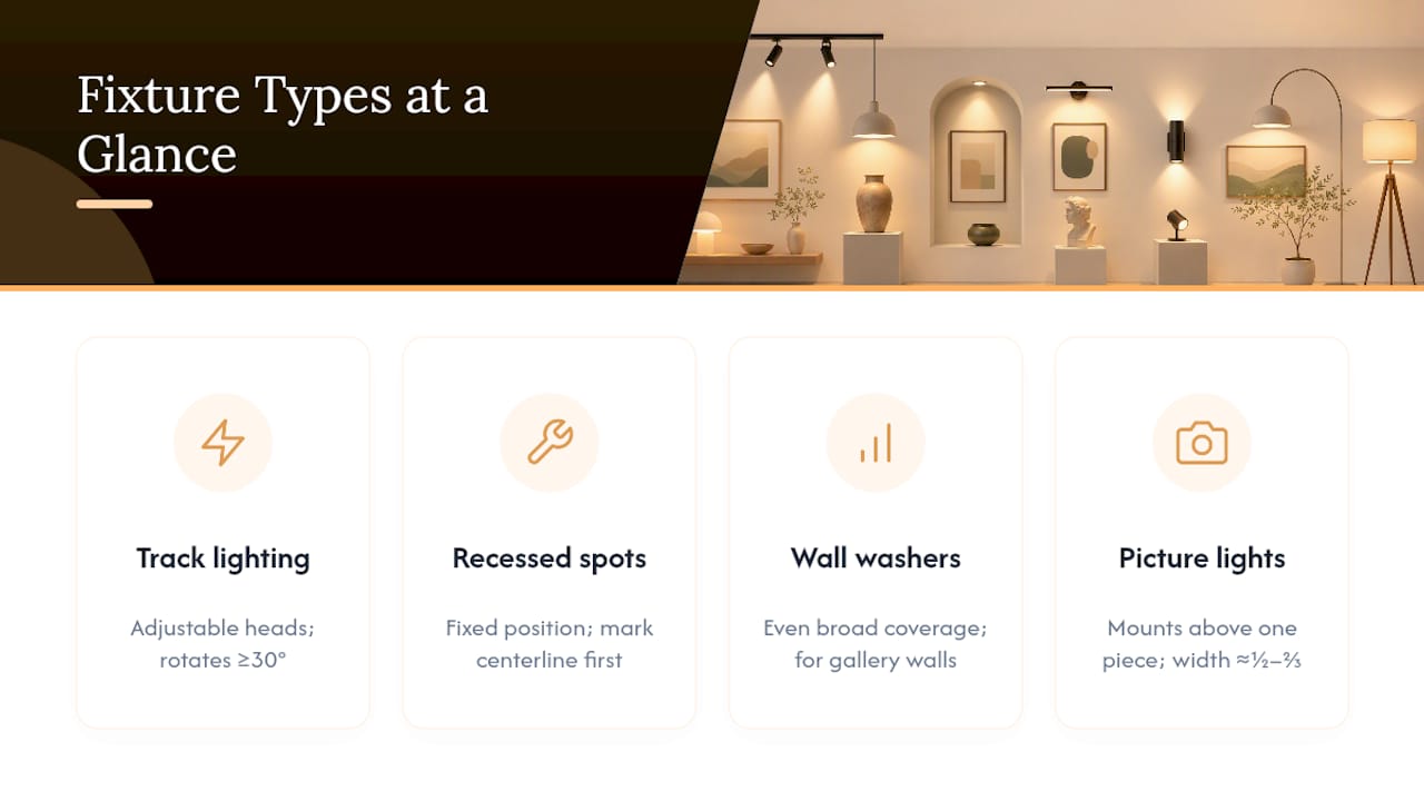
Track lighting works best if you rotate art seasonally or own a growing collection. Adjustable heads let you re-aim in seconds, and good beam control keeps light off adjacent walls. Look for heads with at least 30 degrees of rotation and a narrow-to-medium beam spread option.
Recessed accent or spot lighting gives you the cleanest ceiling line, but the tradeoff is commitment. Once installed, the fixture’s position is fixed, so measure and mark your artwork’s centerline before an electrician ever drills a hole.
Wall washers spread even illumination across a broader stretch of wall rather than spotlighting one piece. They suit gallery walls, hallway collections, or any space where several works hang close together and you want consistent ambient brightness instead of individual hotspots.
Picture lights mount directly above a single framed piece and remain the most intimate, decorative option. A sizing rule from lighting practitioners: choose a fixture roughly half to two-thirds the width of your artwork’s frame, so it neither disappears against a large canvas nor overwhelms a small print.
Across every fixture type, prioritize LED over halogen or incandescent. Energy notes LEDs run cooler and last longer, which matters for art because heat and UV both accelerate fading.
Pro Tip: If you’re mixing fixture types on one wall, say a picture light on your largest piece and track heads on smaller ones, match the kelvin and CRI across all of them. Inconsistent color temperature makes identical whites look yellow in one spot and blue in another.
Where Exactly Should the Light Go?
Precise placement turns a decent lighting plan into one that actually disappears into the room, doing its job without calling attention to itself.
- Set your mounting offset. For ceiling-mounted accent heads, a rough offset of one-third of the ceiling height from the wall gets you close to that 30-degree angle without a laser level. In an 8-foot room, that’s roughly 32 inches out from the wall.
- Mount picture lights close. Position the fixture 2 to 6 inches above the top of the frame. Any higher and the beam spreads past the artwork; any lower and the housing crowds the piece visually.
- Match beam spread to width. A narrow beam on a wide canvas creates a bright center and dim edges. Pick a beam angle wide enough to cover the full width of the piece at your mounting distance, erring wider for large canvases.
- Test at the viewing spot. Turn off every other light in the room, stand where you’d normally look at the piece, and adjust tilt and dimmer until hotspots and glare disappear. Small five-degree tilt changes often fix a problem faster than swapping bulbs.
- Check the corners. Even coverage means no dark triangles at the top corners and no blown-out glare at the bottom edge.
How Glass, Varnish, and Texture Change Your Lighting Plan
Surface finish changes everything about how light behaves once it hits the piece.
- Glazed or framed-under-glass pieces need lower brightness and a gentler angle, since glass reflects far more aggressively than canvas. For valuable prints, anti-glare museum glass cuts reflection dramatically and is worth the upgrade cost. Divineprints’ framed wall art buying guide walks through glazing options in more detail.
- Textured oil paintings benefit from a slightly steeper angle to reveal brushwork, but push too far and you get harsh raking shadows across every ridge of paint.
- Deep frames cast their own shadows if the light source sits too close or too high. Give the fixture enough projection distance to clear the frame’s lip.
- Glossy varnish behaves like glass in miniature: a lower, softer angle avoids the same reflective washout.
What Are the Real Conservation and Safety Limits?
Light causes cumulative, permanent damage to pigments and paper, and that damage doesn’t reverse. Both visible light and ultraviolet radiation contribute, which is why conservation guidance from NEDCC treats UV filtering as non-negotiable for anything valuable.
LEDs are the conservation-friendly default because they emit little to no UV and run cooler than halogen or incandescent bulbs, reducing heat-driven deterioration too.
For brightness limits, many collections exhibit sensitive works around 50 lux, while sturdier media like oil paintings can tolerate up to 150 lux with exposure controls in place, according to that same NEDCC guidance. Practical protections include:
- UV-filtering glazing or window film on nearby windows
- Blackout shades or sheers to block direct sun exposure
- Timers or motion-activated lighting so pieces aren’t lit around the clock
- Rotating especially fragile pieces out of display periodically
The tradeoff is simple: brighter light shows more detail but shortens a piece’s lifespan. Base your choice on the artwork’s value and how replaceable it is.
Setting Up and Tuning Your Lights Step by Step
Getting from “bought some fixtures” to “looks intentional” takes about an hour if you follow a sequence.
Before you shop, know five specs: CRI (90+), kelvin (2700 to 3000K), lumen output (150 to 300 per piece as a baseline), beam angle, and whether you need a dimmable driver. Decide plug-in versus hardwired based on whether you’re renting or own the wall.
Installing:
- Measure and mark the artwork’s centerline on the wall or ceiling.
- Mount the fixture at your calculated offset or height.
- Aim it toward roughly 30 degrees, adjusting by eye.
- Turn off ambient light and test from the normal viewing distance.
- Adjust tilt, then dim brightness until hotspots vanish.
For wide pieces, a single fixture rarely covers the whole surface evenly. Add a second head and overlap the beams slightly rather than cranking one fixture to max brightness.
Pro Tip: Glare in one corner almost always means the angle is too shallow, not that the bulb is too bright. Steepen the tilt a few degrees before you touch the dimmer.
Ambient, Accent, and Task Lighting: What Each One Does for Art
Three lighting categories work together in any room that displays art well, and confusing them is where most home setups go wrong.
Ambient lighting fills the room with general illumination, ceiling fixtures, lamps, and daylight combined. It sets the baseline mood but almost never provides enough directional punch to make a painting pop. Rely on ambient alone and your art looks flat, present but unremarkable.
Accent lighting is the dedicated beam aimed specifically at a piece, whether from a track head, recessed spot, or picture light. This is the layer doing the actual work of making a painting or sculpture the focal point of a wall. Christie’s lighting experts frame this as a deliberate choice: do you want the art to visually pop against a dimmer room, or do you want it living within an evenly washed, uniformly bright space? Both are valid, but they call for different fixture strategies.
Task lighting rarely applies to displayed art directly, but it matters in studios, offices, or reading nooks where art shares wall space with functional lighting needs. A desk lamp bright enough for reading can throw stray light across a nearby print and wash out the accent lighting you carefully tuned.
The strongest displays layer all three deliberately. Ambient light keeps the room livable, accent lighting draws the eye to specific pieces, and task lighting stays contained to its own zone rather than bleeding across the wall. Architectural Digest’s guidance frames this layering as the difference between a room that merely contains art and one built around it.
Using Multiple Light Sources for Depth
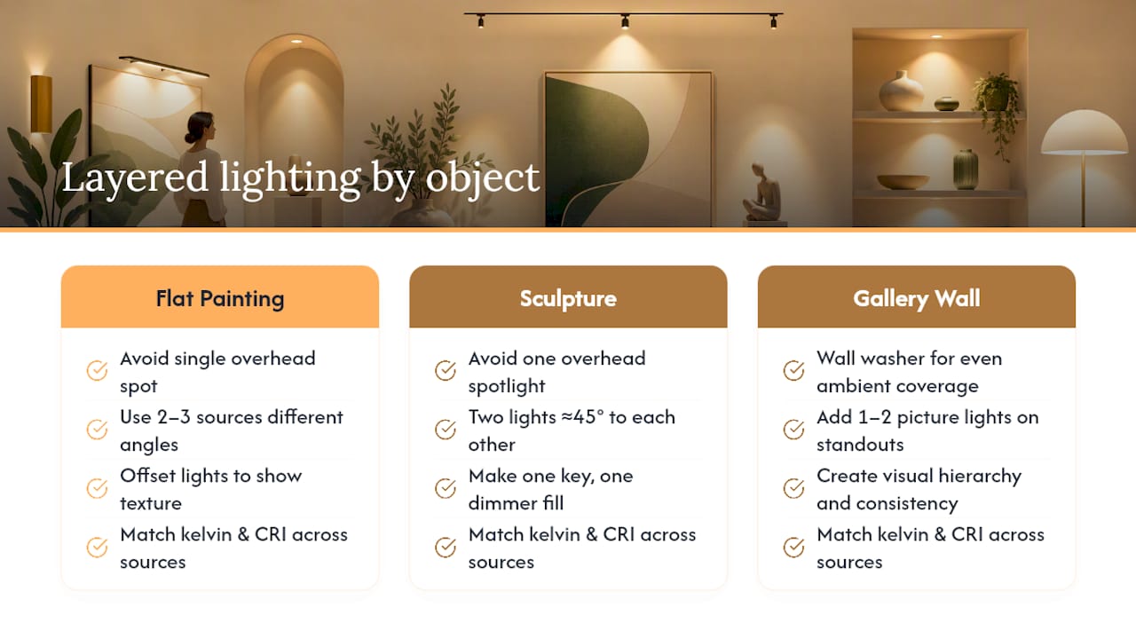
A single overhead spot flattens a painting. Layer two or three sources at different angles, and suddenly brushwork, frame depth, and surface texture all read with more dimension.
The trick is avoiding redundancy. If two fixtures hit the same spot from nearly identical angles, you’ve wasted a light source and possibly doubled your glare risk. Instead, offset a second fixture to catch texture from a slightly different direction, or use one light for the main wash and a second, dimmer one to fill shadow on a three-dimensional piece like a relief carving or sculpture.
For sculptures specifically, multiple sources matter more than for flat paintings. A single spotlight from directly above creates harsh under-eye shadows and flattens the piece from every other viewing angle. Two lights positioned at roughly 45 degrees to each other, one slightly brighter as the “key” light and one dimmer as fill, reveal form the way gallery lighting does for three-dimensional work.
Consistency across sources is non-negotiable. Mixing a 2700K picture light with a 4000K recessed can makes identical white backgrounds look warm in one spot and cool in another, and the eye catches that mismatch even when it can’t name what’s wrong. Match kelvin and CRI across every fixture on the same wall or in the same room.
For a gallery wall with several pieces at different depths and sizes, a wall washer providing even ambient coverage plus one or two picture lights on the standout pieces gives you both consistency and hierarchy. Divineprints’ gallery wall layout guide covers how spacing and grouping interact with this kind of layered lighting.
Managing Natural Light Around Displayed Art
Direct sunlight is the single fastest way to fade a painting, print, or textile, and it does damage no dimmer switch can undo. Unlike controlled artificial lighting, sunlight carries UV radiation and shifts intensity throughout the day, making it impossible to hold at a safe, consistent level.
The fix isn’t necessarily avoiding windows entirely. It’s controlling what reaches the art. UV-filtering window film blocks the most damaging wavelengths while still letting in visible light. Blackout shades or sheer curtains give you manual control for the hours when direct sun hits a specific wall. For genuinely valuable or irreplaceable pieces, the safest wall is one that never receives direct sun at any point in the day, check this by watching the room across a full afternoon before you hang anything permanent.
Natural light also shifts color temperature constantly, from cool blue at midday to warm orange at sunset, which means a piece lit primarily by a window looks different every few hours. That’s fine for casual decor but frustrating if you want consistent presentation. Artificial accent lighting set to a fixed 2700K to 3000K gives you a stable baseline regardless of what’s happening outside.
If a wall gets indirect daylight rather than direct beams, that’s usually manageable with basic precautions, UV film and periodic monitoring for any early fading at the edges nearest the window. Direct sun for multiple hours a day on anything paper-based, however, calls for relocating the piece rather than trying to out-engineer the sun with glazing alone.
Lighting Paintings, Sculptures, Textiles, and Photographs Differently
Different mediums fade, reflect, and reveal detail in different ways, so a single lighting formula doesn’t serve all of them equally well.
Oil and acrylic paintings tolerate more light than paper-based media and benefit from a steeper angle that reveals brushwork and texture. Glossy varnish, though, reflects aggressively, so keep the angle gentle enough to avoid a washed-out glare zone.
Sculptures need directional variety rather than a single flat wash. Multiple light sources at different angles reveal form and shadow the way a single overhead spot never can, and rotating pieces occasionally lets you re-evaluate which angle flatters the form best.
Textiles, tapestries, embroidered pieces, quilts, are among the most light-sensitive materials in any home collection. Dyes fade fast under both UV and visible light, so keep these pieces on the dimmest end of your lighting plan and rotate them out of prime display periodically if they matter to you.
Photographs and works on paper sit at the fragile end of the spectrum too. Prints and photographs deserve the lowest brightness settings and the strictest UV control of anything on this list, closer to that 50 lux museum baseline than the 150 lux ceiling reserved for sturdier oil paintings.
Glass-framed pieces of any medium add their own complication: reflection. Lower brightness and a gentler angle reduce glare regardless of what’s behind the glass.
The Mistakes That Ruin an Otherwise Good Lighting Setup
Most bad art lighting isn’t a fixture problem. It’s a handful of predictable, fixable errors.
Aiming too steep or too shallow. Anything far from that 30-degree range either glares straight back at the viewer or throws harsh, unflattering shadows off the frame.
Mismatched color temperature across a room. A 2700K picture light next to a 5000K daylight-toned recessed can makes both pieces look wrong, even though each light is fine on its own.
Skipping the dimmer. Fixed-brightness fixtures leave you stuck between “too dim to appreciate” and “too bright to protect the piece.” A dimmer lets one fixture serve both daytime viewing and evening ambiance.
Ignoring window exposure. Hanging a paper print on a sun-facing wall because it happened to have the right amount of space is one of the most common and most avoidable conservation mistakes homeowners make.
Using one light for a whole gallery wall. A single fixture cranked to max brightness to cover six pieces creates uneven hotspots and dark corners. Multiple smaller, well-aimed fixtures beat one oversized one every time.
Forgetting to test at the actual viewing spot. Lighting that looks perfect from a ladder can glare or shadow badly from eye level six feet back. Always do your final check from where you’ll actually stand.
How This Applies to Devotional and Saint Prints
Devotional prints often hang in smaller, more intimate spaces, a prayer corner, a hallway, an altar table, where a single picture light does more work than a full track system. For a framed saint print in the common 11x14 or 16x20 range, a picture light sized to roughly half the frame’s width, mounted a few inches above it, gives that quiet, focused glow devotional art usually calls for. For a wall grouping of several prints, a soft wall wash keeps the whole prayer space evenly lit without singling out one image over another.
Divineprints Makes It Easy to Put That Lighting Plan to Use
Once your fixtures and angles are dialed in, the next step is having artwork worth lighting well. There are framed and unframed devotional prints, saints, Jesus, and Gospel scenes, available in sizes built to pair naturally with a single picture light or a small track setup, which matters if you’re working with the fixture-to-frame ratios covered earlier in this piece.

If you’re renting and can’t drill into a wall for hardwired fixtures, a plug-in picture light is the simplest starting point paired with any framed piece from the saint prints collection. It requires no electrician, mounts with light hardware, and gives you that focused 2700K to 3000K glow the whole article has been building toward. Browse a piece like The Sacred Heart of Jesus or The Transfiguration of Jesus to see sizing options before you finalize your fixture placement, then hang and light it using the offset and angle guidance above.
Sources
For deeper reading beyond this guide: Architectural Digest’s lighting tips cover angle and fixture basics, Christie’s expert guide addresses museum-grade color rendition, NEDCC’s preservation leaflet details light damage and lux limits, and Energy.gov’s LED guidance explains why LEDs are the conservation-smart default.
- 8 Tips for Lighting Art: How to Light Artwork in Your Home — Architectural Digest
- An expert guide to lighting your artworks — Christie’s
- 02-04 Protection from Light Damage — NEDCC
FAQ
What Is the 3-Point Lighting Rule for Art?
The version most relevant to art display uses a key light aimed at roughly 30 degrees to establish the main illumination, a fill light or second angle to soften shadows on dimensional pieces like sculptures, and ambient room light to keep the surrounding wall from looking like a dark void around a single bright spot.
What Is the 5-7 Lighting Rule?
This isn’t a standard art-lighting term with a fixed definition; if you’ve seen it referenced, it likely refers to mounting heights or distances specific to a particular fixture brand rather than a universal museum standard.
What Is the 70/30 Rule in Art Display?
Definitions vary by source, but in a lighting context, it commonly refers to maintaining a majority of a room’s illumination as soft ambient light while reserving a smaller portion as focused accent lighting on the art itself, which prevents the piece from looking harshly spotlit in an otherwise dark room.
What Is the 80/20 Rule in Painting?
This term usually applies to composition or color balance within a painting itself, not to how the piece is lit, so it falls outside standard lighting guidance and is better addressed by art instruction resources.
What Kelvin and CRI Should I Use for Art Lighting?
Use 2700K to 3000K for warm, natural-looking color and a CRI of 90 or higher, with 95 as the museum-quality benchmark, according to both Architectural Digest and Christie’s lighting guidance.