

For most devotional and giftable Christian wall art, luster is the better default finish — it preserves color saturation, makes gold leaf and halos pop, and holds up to the handling that comes with gifts and keepsakes. Divineprints offers both finishes, and the right call shifts when framing or room lighting enters the picture.
Quick verdict by use-case:
- Luster: jewel-toned saint portraits, images with gold leaf or metallic halos, frequently handled prints, unframed devotional art, baptism and Confirmation gifts
- Luster: large biblical scenes where color depth matters (think a richly colored Transfiguration or Sacred Heart)
- Matte: soft-palette or black-and-white iconography, prints displayed behind glass in bright rooms, gallery-style parish installations
One caveat worth keeping front of mind: if the print will hang behind standard glass in a sun-facing room, display environment often matters more than the paper finish itself.
Table of Contents
- Which finish is right for you? Five questions to ask first
- How matte and luster change color, contrast, and gold accents
- How durable are these finishes for handled devotional prints?
- How framing and glazing change the finish trade-offs
- What paper and canvas options pair best with each finish?
- Finish recommendations by display scenario
- How Divineprints approaches luster vs matte
- What affects production time and cost?
- Key Takeaways
- Finish is a devotional choice, not just an aesthetic one
- Divineprints makes choosing your finish straightforward
Which finish is right for you? Five questions to ask first
Choosing between a luster finish vs matte finish does not require a degree in printing. Five honest questions will get you there.
- Where will it hang? A wall opposite a window or directly under a lamp is high-glare territory. Matte is the safer choice in bright rooms; luster works fine in dim corners or north-facing walls.
- Who will handle it? A framed keepsake that stays on the wall is different from a small saint portrait passed around at a First Communion party. Luster hides fingerprints and scuffs far better than matte, which can suffer permanent damage from a single oily touch.
- Does the image rely on vivid color or soft tones? A jewel-toned icon of St. Michael with a gold sword benefits from luster’s color depth. A soft charcoal portrait of St. Thérèse reads better in matte.
- Will it be framed behind glass? If yes, the glazing choice changes everything (more on that below). Matte behind standard glass is usually easier to live with; luster behind anti-reflective glass is equally good.
- What is your archival priority? Museum-grade fine-art matte paper is a premium substrate, but it demands careful handling and museum-quality glazing. Standard luster on acid-free paper with pigment inks is a more forgiving archival choice for most home settings.
Pro Tip: Before you order, hold your phone flashlight at the angle of your room’s main light source against the wall where the print will hang. If you see a strong hot spot, lean toward matte or plan for anti-reflective glazing.
How matte and luster change color, contrast, and gold accents
This is where the choice gets genuinely interesting for sacred imagery.
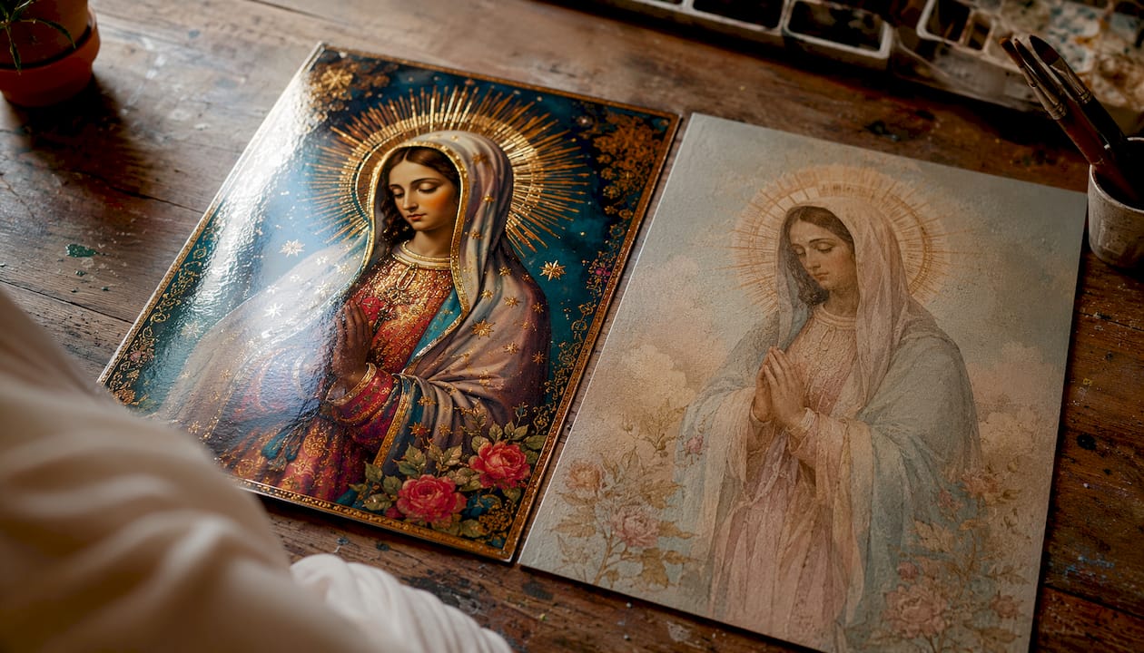
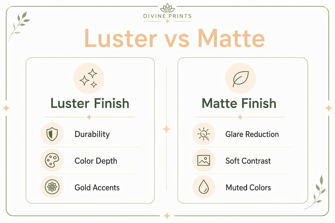
Luster’s semi-gloss surface balances light diffusion with color depth, giving portraits lively midtones without the mirror-like shine of full gloss. For saint portraiture, that means skin tones stay warm and vestment colors stay rich. Gold leaf, halos, and metallic accents catch just enough light to read as luminous rather than flat. A print of the Sacred Heart with its warm reds and gold rays simply looks more alive on luster.
Matte diffuses light in every direction, which removes glare but also softens contrast and mutes highlights. That quality suits traditional iconography with flat, symbolic color fields, black-and-white devotional portraits, and any image where the goal is quiet contemplation rather than visual impact. Matte’s non-reflective surface creates a refined, gallery-like look that many people associate with fine art.
| Dimension | Luster finish | Matte finish |
|---|---|---|
| Best for | Jewel-toned saint portraits, gold accents, gifts | B&W iconography, soft palettes, gallery display |
| Glare / reflectivity | Low to moderate | Near zero |
| Color pop | Strong, warm, saturated | Softer, more painterly |
| Metallic accent behavior | Accents read as luminous | Accents appear flatter |
| Framing required | Optional | Recommended (museum glass for fine-art matte) |
A bright jewel-toned portrait of St. Catherine of Siena? Luster. A soft pastel or monochrome print of Our Lady of Guadalupe? Matte earns its place there.
How durable are these finishes for handled devotional prints?
The answer is direct: luster wins on durability, and the gap is meaningful for devotional use.
Luster’s micro-textured “orange peel” surface is engineered to balance light diffusion with scratch resistance. Matte coatings are porous by design, which is what gives them that velvety feel, but porosity also means finger oils, scuffs, and even cleaning attempts can leave permanent marks.
Common handling risks and how each finish responds:
- Finger oils: Luster masks them; matte absorbs them and can stain permanently
- Scuffs from packaging or stacking: Luster’s texture provides a buffer; matte scratches more easily
- Cleaning: A soft dry cloth on luster is usually fine; rubbing matte surfaces risks smearing the coating
- Unframed display: Luster handles it well; fine-art matte demands museum-grade glazing to stay pristine
Pro Tip: For small devotional prints that will be gifted, passed around, or displayed on a home altar without a frame, choose luster every time. Reserve fine-art matte for pieces going straight into a frame with quality glass.
How framing and glazing change the finish trade-offs
Here is a point most guides skip: glazing often determines perceived glare more than the paper finish itself. The glass in front of a luster print can add more reflection than the print’s own surface ever would.
Common glazing options and how they interact with each finish:
- Standard clear glass: Adds its own reflection layer. Matte paper behind standard glass is usually the easiest combination to live with in a bright room. Luster behind standard glass in a sun-facing room can produce double reflections.
- Non-reflective / anti-glare glass: Neutralizes luster’s sheen almost completely. This pairing gives you luster’s color depth with near-matte viewing comfort.
- UV-protective museum glass: The premium choice for archival devotional art. Works beautifully with both finishes and protects pigment inks from fading.
- Acrylic (Plexiglas): Lighter than glass, good for large pieces. Anti-reflective acrylic is available and pairs well with luster for large biblical scenes.
Float frames (where the print appears to float inside the frame without a mat board) work with both finishes. A traditional mat board surround protects matte paper edges and adds a gallery feel. If you are hanging in a bright room with standard glass, favor matte paper or upgrade to anti-reflective glazing for luster.
What paper and canvas options pair best with each finish?
The substrate matters as much as the finish label. A few key categories:
- Luster / satin photographic paper: The most common lab default. Acid-free, pigment-ink compatible, and durable. The right choice for most saint portraits and gift prints.
- Standard matte photographic paper: Less expensive, less durable. Fine for casual display but not for heirloom pieces.
- Fine-art matte (cotton rag or alpha-cellulose): Heavier, archival, and genuinely beautiful. Requires museum-grade handling and glazing. Best for gallery-quality devotional art.
- Canvas: Carries its own texture that reads as inherently matte. Works well for large biblical scene prints and gives a painterly, traditional feel without the glare question entirely.
- Metallic paper: A specialty substrate that amplifies gold and silver accents dramatically. Worth considering for angelic imagery or prints with strong metallic elements.
Archival specs to request: acid-free paper, pigment-based inks (not dye-based), and archival mounting materials. Pigment inks on luster paper typically offer significantly longer fade resistance than dye inks, making them the right call for devotional pieces meant to last decades.
Pro Tip: When ordering a print with gold leaf or metallic accents, request a soft proof or physical swatch before committing to a large size. Color rendering on metallic details varies between substrates in ways that are hard to predict from a screen.
Finish recommendations by display scenario
| Scenario | Recommended finish | Why |
|---|---|---|
| Small devotional print / holy card | Luster | Handles touch, preserves color |
| Framed saint portrait, living room | Matte or luster + anti-reflective glass | Depends on room light |
| Large biblical scene over a mantel | Luster or canvas | Color depth at scale |
| Church nave or parish hall | Matte or canvas | Mixed lighting, distance viewing |
| Baptism / First Communion gift | Luster | Durability, vibrant color for keepsake |
| Gallery-style home chapel | Fine-art matte + museum glass | Reverent, non-reflective finish |
For patron saint gifts that will be unwrapped, admired, and handled before framing, luster is the practical and beautiful choice.
How Divineprints approaches luster vs matte
Divineprints is a dedicated e-commerce source for Catholic and Christian saint prints, biblical scenes, and devotional wall art, offering museum-grade fine art prints and canvases in multiple sizes and frame types. The finish options available include luster/satin, matte, and canvas, each suited to different devotional contexts.
Ordering steps:
- Browse the saint prints collection or biblical events and select your image and size
- Choose your finish (luster for handled gifts and vibrant imagery; matte for gallery or soft-palette pieces)
- Request a physical swatch or soft proof for color-critical pieces, especially those with gold or metallic accents
- Select framing and glazing options, including protective museum glass for archival pieces
- Place your order with confidence that archival paper and pigment inks are standard
Swatches and proofs reduce returns and help you confirm that a gold halo reads the way you expect before committing to a large format. Protective glazing upgrades are available at checkout and tie directly to the framing guidance above.
What affects production time and cost?
Finishes and protective upgrades add modest time and cost, but the specifics are worth knowing before you order.
- Paper grade: Fine-art matte costs more than standard luster photographic paper
- Pigment inks: Standard for archival quality; included in museum-grade print options
- Custom framing: Adds lead time, typically several business days beyond standard print turnaround
- Museum or anti-reflective glass: The single biggest cost driver in a framed order
- Size: Larger prints cost more to frame and ship; factor this in for church or parish installations
- Expedited options: Available for standard prints; custom framing may not qualify
For heirloom gifts like Confirmation or baptism prints, the museum glass upgrade is worth the cost. For a parish hall installation covering a large wall, canvas without glass eliminates the glazing cost entirely while still delivering an archival result.
Key Takeaways
For most Christian and Catholic wall art, luster is the best default finish because it preserves color, resists handling damage, and makes gold and metallic accents read as intended.
| Point | Details |
|---|---|
| Luster is the default | Choose luster for most saint portraits, gifts, and images with gold or metallic accents. |
| Matte suits specific cases | Use matte for soft-palette or B&W iconography, gallery display, or prints behind standard glass in bright rooms. |
| Glazing changes everything | Anti-reflective or museum glass lets you use luster in bright rooms without glare problems. |
| Archival specs matter | Request acid-free paper and pigment inks for any devotional piece meant to last decades. |
| Divineprints offers both | Divineprints carries luster, matte, and canvas options with framing and museum glass upgrades for devotional wall art. |
Finish is a devotional choice, not just an aesthetic one
Most finish guides treat luster vs matte as a purely technical question. For devotional art, it is something more. The finish affects how a saint’s face reads in morning light, whether a gold halo draws the eye the way it should, and whether a print survives years of daily encounter with the sacred image it carries.
My honest view: luster is underused in devotional contexts because people assume it looks “too photographic.” It does not. On a well-printed saint portrait with warm pigment inks, luster looks rich and alive in a way that honors the image. Matte is genuinely beautiful for the right piece, but it demands more from the framing and the room. When in doubt, choose the finish that lets the image do its work without distraction.
Divineprints makes choosing your finish straightforward
Picking between luster and matte is easier when you can see both before you commit. Divineprints offers a full range of saint prints and biblical scenes printed on museum-grade paper with pigment inks, available in luster, matte, and canvas, framed or unframed.
Whether you are ordering a Sacred Heart print in luster for a home altar or a soft matte portrait for a gallery-style chapel wall, the process is simple: choose your image, select your finish, add framing and glazing if needed, and request a swatch or proof for any color-critical piece. Museum glass and archival mounting are available at checkout. Browse the full collection at Divineprints and find the print, finish, and framing that fits your space and your faith.