

The safest, most reliable entryway wall art idea is one strong statement piece, sized to roughly two-thirds the width of your console and hung with its center around eye level from the floor. Wider walls or bigger foyers can handle a matching pair or a tight cluster of three to five pieces instead. Everything else in this guide is just the fine print on making that one decision look intentional.
TL;DR:
- Use a large statement piece sized to about two-thirds the width of your console and hang it at eye level for maximum impact.
- Narrow entries benefit from a single vertical piece of 18 by 24 inches or similar size, while wider foyers can support larger or paired artworks.
- Match your art style and palette to the overall home theme, with bold colors for quick visual impact and devotional art for meaningful first impressions.
- Use acrylic glazing for high-traffic entries to prevent damage and opt for frames that complement your other decor elements.
- Renters can test layouts with command strips and take photos of mockups to perfect the arrangement before hanging.
Table of Contents
- Entryway Wall Art Ideas That Actually Work
- Sizing and Placement: The Rules That Keep You From Guessing
- Choosing a Style That Sets the Right Tone
- Materials, Framing, and What Actually Holds Up
- Styling the Wall Art With Your Console and Lighting
- Budget-Friendly and DIY Approaches
- Why Faith-Centered Homes Deserve More Than an Afterthought Entry
- Bringing Devotional Art Into Your Own Entryway
- Sources
Entryway Wall Art Ideas That Actually Work
Not every idea fits every wall, but a handful of approaches cover almost every entryway shape and style. Here’s how to match the idea to your space.
-
Single statement piece. This is the default for a reason: it’s the highest-return wall investment in most homes, especially above a console in a narrow entry. One large, confident image reads as decorated. Three small ones scattered without a plan read as clutter.
-
Matching pair. Flanking a doorway or splitting a wider wall with two identical or complementary pieces creates symmetry fast. This works especially well when you’ve already got sconces or twin lamps to echo.
-
Small cluster of three to five. Spacious foyers can absorb a tighter grouping without feeling busy. Keep spacing consistent (2 to 3 inches between frames) and stick to one visual thread, whether that’s frame color, subject matter, or matting, so the group reads as one composition instead of five accidents.
-
Mirror as art. When your entry lacks a window, a mirror does double duty: it bounces light around and gives you a last glance before you leave. Pair a mirror with one framed print rather than two mirrors, or you lose the “art” part of the equation entirely.
-
Textural or sculptural pieces. Carved wood panels, woven wall hangings, or dimensional plaster pieces add depth in entries with enough wall clearance to let something project a few inches without becoming a hazard.
-
Typography and short phrases. A single word or short blessing over a console sets tone instantly. For faith-centered homes, this is often where devotional text or a saint print does the most work, since the message greets everyone who walks through the door.
Sizing and Placement: The Rules That Keep You From Guessing
Get the numbers right and the rest of the styling almost takes care of itself.
- Hang the center of your art at about eye level from the floor as a baseline; go slightly higher if your entry is viewed standing and walking rather than seated.
- Over a console or table, size the art to about two-thirds the furniture’s width, per the two-thirds rule for entry art.
- If the console is unusually tall, leave roughly a hand’s width of breathing room between the furniture top and the bottom of the frame.
- Narrow entries usually call for one vertical piece in the 18 by 24 inch to 24 by 36 inch range; wider foyers can support a 36-inch-plus statement piece or a pair of 20 by 24 inch frames.
- Before you commit to a nail hole, tape a kraft-paper cutout of your intended size to the wall and live with it for a day.
- Lay out gallery groupings on the floor first, then transfer the arrangement to the wall.
- Renting? Command strips hold real weight and come off clean, which makes testing placement risk-free.
Pro Tip: Photograph your mockup on your phone before hanging anything. A photo flattens the wall the way guests actually see it walking in, and it’s much easier to judge proportions from a screen than standing three feet away from the actual wall.
Choosing a Style That Sets the Right Tone
Your entryway is the first thing anyone sees, so the style you pick there sets an unspoken promise for the rest of the house. A moody abstract print signals something different than a soft botanical watercolor, and neither is wrong, but they should match what’s coming next.
- Bold color works in entries because guests pass through quickly rather than staring for an hour, but if your piece is saturated, keep the console, rug, and walls around it calmer so the art stays the focal point.
- Figurative and portrait pieces read best in small entries when the gaze in the image is slightly averted rather than staring straight out at anyone who opens the door.
- Landscape and botanical prints tend to soften hard-edged, modern entries without fighting the architecture.
- Devotional art, including saint prints or Gospel-inspired imagery, works particularly well at entry scale because the subject matter carries meaning even in a quick glance, not just a lingering one.
- Choose your palette based on the rooms your entry connects to, since a jarring shift the moment someone rounds the corner undercuts the whole effect.
Materials, Framing, and What Actually Holds Up
Gallery-wrapped canvas skips the frame entirely and hangs flush against the wall, which suits a clean, modern look and needs zero extra hardware. Framed giclée prints, on the other hand, give you a defined edge that plays well against busier wallpaper or trim.
- Choose acrylic glazing over glass in high-traffic entries, since glass near a front door is one stray umbrella away from a crack.
- Archival pigment inks resist fading far longer than standard prints, but keep any piece out of direct sunlight regardless of ink quality.
- Match your frame finish, whether black, gold, or walnut, to your lamp base or door hardware so the vignette feels planned rather than assembled piece by piece.
Styling the Wall Art With Your Console and Lighting
Interior stylist Emily Henderson’s approach to entries leans on a handful of repeatable entryway design formulas, and one of the simplest to copy is console plus lamp plus wall art.
- Size the art to the console. Keep it at roughly two-thirds the console’s width so the composition doesn’t look top-heavy or lost.
- Add a lamp on one side. A table lamp gives the artwork presence after dark, when overhead light alone flattens everything.
- Balance with one taller accent. A vase, small branch, or framed leaning piece on the opposite side keeps the lamp from feeling lonely.
- Keep a low tray or bowl for keys and mail. This is where pairing function with decoration actually pays off, since an entry that only looks good but holds nothing gets ignored fast.
- Cap it at three to five objects total. More than that competes with the art instead of supporting it.
- Repeat one or two metal or wood tones. Whatever finish shows up in your frame should echo somewhere in the lamp base or tray.
Budget-Friendly and DIY Approaches
You don’t need a big budget to get a strong entry wall. You need one good decision.
- Spend your money on one quality focal piece rather than splitting it across several cheap prints that all read as filler.
- Order a printable file and have it printed locally on a heavier matte or archival paper stock, then mount it in a simple frame.
- Thrifted frames get a second life fast with a fresh coat of paint and a new mat board.
- Command strips and other removable hanging hardware let renters test full gallery layouts without a single nail hole.
Pro Tip: A $40 print in a well-chosen frame with the right mat almost always outperforms a $150 print jammed into whatever frame it shipped with.
Why Faith-Centered Homes Deserve More Than an Afterthought Entry
Devotional art gets treated as an afterthought in most decorating advice, which is a mistake. An entry is the one wall every visitor sees before they’ve settled into the rest of your home, and a saint print or Gospel scene there does something a landscape print can’t: it sets intention before conversation even starts. Divineprints builds its saint prints and larger gallery-quality canvases specifically with that entry moment in mind, sized so a single piece can carry a whole wall. For a compact entry, a framed print reads slightly more formal; a gallery-wrapped canvas feels more modern and needs no extra hardware. If you’re mapping out a fuller wall beyond one piece, our gallery wall layout guide walks through spacing for multiple prints.
— Griffin
Bringing Devotional Art Into Your Own Entryway
Certain Christian art sellers focus on providing museum-grade prints and canvases featuring saints, Gospel scenes, and devotional imagery designed specifically for prominent display in home entryways.
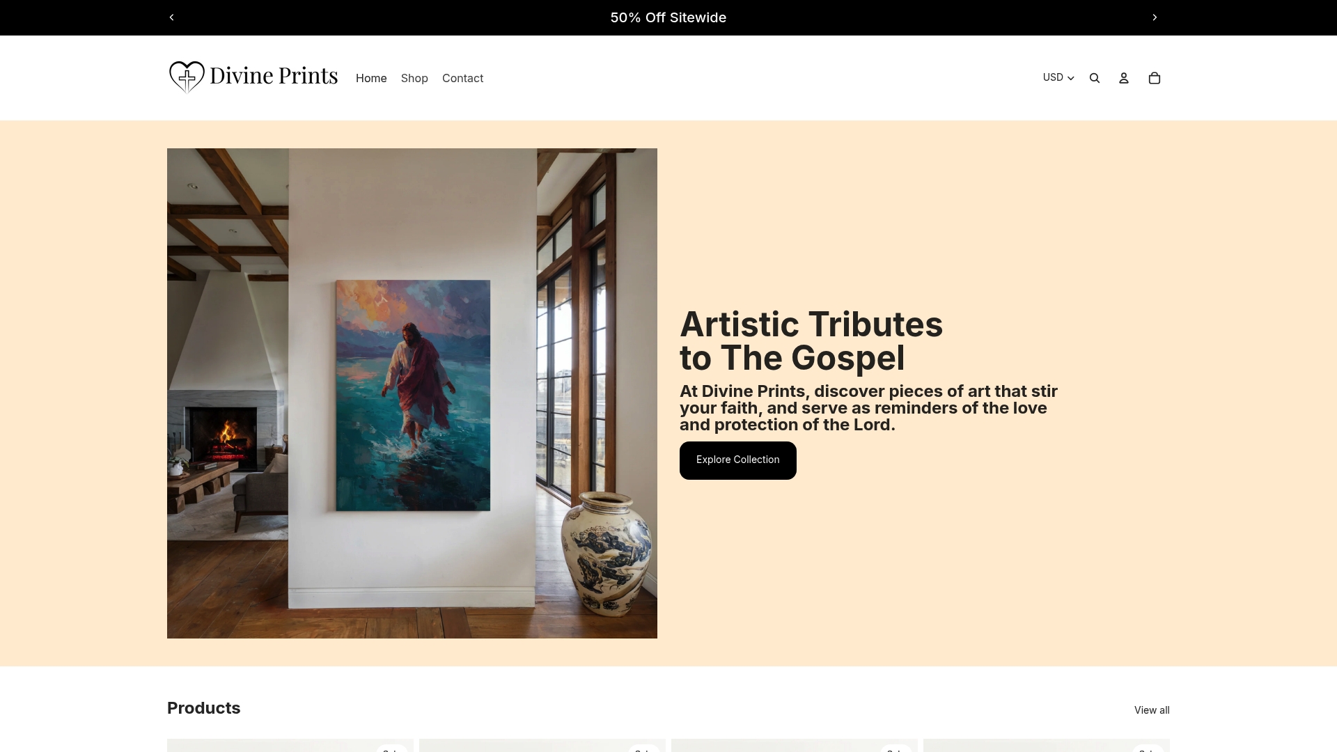
Picking the right piece comes down to two decisions on the product page: size relative to your console (that two-thirds rule again) and finish, canvas for a clean modern hang or a framed print for a more formal edge. The Sacred Heart of Jesus print works well as a single anchor piece over a narrower console, while The Transfiguration has the scale to hold its own on a wider wall. Before you order, glance at your adjoining room’s palette so the entry doesn’t feel like a hard stop the moment someone steps further inside. Browse the saint print collection and pick the size and frame that fits your wall.
Sources
- How to design an entryway | Style by Emily Henderson
- Entryway Wall Art That Makes a Strong First Impression | Seembols
- Front porch and entryway decor ideas | HGTV
- Entryway & hallway wall art: how to choose | Fine Art Canvas