

Keep 2 to 3 inches between frames, tightening to 1.5 inches for small pieces and widening to 3 to 4 inches for large ones. Center the whole arrangement 57 to 60 inches from the floor, using 57 inches in rooms where people mostly sit. Above furniture, leave a few inches of clearance and keep the arrangement’s width proportional to roughly two-thirds of the furniture’s width or similar.
TL;DR:
- Consistency in spacing is crucial, with 2 to 3 inches between frames being the standard; larger gaps are needed for statement pieces, while small prints need narrower gaps.
- The ideal optical center height is 57 to 60 inches from the floor, adjusted slightly for seated or standing viewing, and the entire arrangement should maintain proportional width to surrounding furniture.
- Measure all frame dimensions including moulding and use a single gap throughout to ensure a professional, balanced look; employing paper templates and spacers prevents errors.
- For layouts, match gaps across grids, clusters, or linear arrangements, and adjust spacing slightly when mixing frame sizes or styles to maintain visual flow.
- Lighting conditions and frame depth influence perceived gaps; measure in the actual lighting and confirm visually, especially with deep canvases or shadow-casting frames.
Table of Contents
- The Essential Gallery Wall Spacing Rules and Why They Matter
- How Do You Calculate Your Gallery Wall’s Footprint?
- How Does Spacing Change Across Different Gallery Wall Layouts?
- What’s the Right Way to Install a Gallery Wall Without Extra Holes?
- Common Gallery Wall Mistakes and How to Fix Them
- Practitioner Shortcuts That Save Time and Prevent Errors
- Does Frame Width and Depth Change How You Space Things?
- How Should Spacing Change on Small Walls vs. Large Walls?
- How Do You Transition Spacing When Mixing Frame Sizes?
- Can Lighting Change How Spacing Actually Looks?
- How Do You Space Shelves and Plants Within a Gallery Wall?
- Arranging Devotional Gallery Walls With Purpose
- Where to Find Anchor Prints for Your Devotional Gallery Wall
- Arranging Sacred Art Isn’t Just Decorating. It’s Curating a Devotional Space
- Sources
- FAQ
The Essential Gallery Wall Spacing Rules and Why They Matter
Every rule below exists because your eye reads a gallery wall as one shape, not a pile of separate frames. Get the gaps and the center height wrong and the brain notices before it even registers what’s in the frames.
The 2 to 3 inch gap is the workhorse number. It’s tight enough that the pieces feel connected, loose enough that each frame still reads as its own object. Drop to 1.5 to 2 inches for a cluster of small prints, postcards, or anything under about 8 by 10 inches. Widen to 3 to 4 inches when you’re working with statement pieces 24 inches or larger. The mistake people make isn’t picking the wrong number. It’s picking three different numbers for one wall.
Optical center height sits at 57 to 60 inches, which is the museum standard for average adult eye level. Use 57 inches in dining rooms, breakfast nooks, or anywhere people spend most of their time seated. Push closer to 60 in a great room or entryway where people are standing and moving through. Tall ceilings don’t change this number. The temptation to hang higher to “fill the space” is exactly what makes a gallery wall look like it’s floating.
Above furniture, the math shifts slightly. Leave 6 to 8 inches between the top of the furniture and the bottom edge of your lowest frame. Anything past 12 inches and the artwork stops feeling connected to the piece below it, like the two were never meant to go together. For width, aim for roughly two-thirds of the sofa or console width, with 60 to 75 percent as your workable range.
Key numbers at a glance:
- Standard gap between frames: 2 to 3 inches
- Small-frame gap: 1.5 to 2 inches
- Large-frame gap: 3 to 4 inches
- Optical center height: 57 to 60 inches from the floor
- Clearance above furniture: 6 to 8 inches
- Arrangement width vs. furniture: 60 to 75 percent (two-thirds is the sweet spot)
One more number worth remembering: leave at least 3 inches between your outermost frame and any ceiling line, doorframe, or light switch. Anything tighter reads as cramped rather than intentional.
How Do You Calculate Your Gallery Wall’s Footprint?
You can’t eyeball a gallery wall footprint and expect it to land right. You need three measurements: the outside dimensions of every frame, your chosen gap, and simple addition.
The formula for a single row is straightforward:
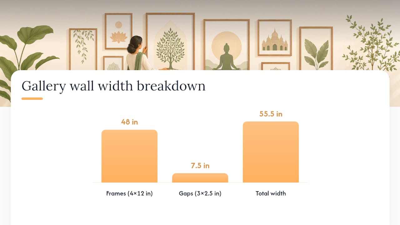
Total width = (sum of all frame widths) + (gap × number of gaps between frames)
So four frames, each 12 inches wide, spaced 2.5 inches apart, gives you (12 × 4) + (2.5 × 3) = 48 + 7.5 = 55.5 inches of total width. That last part trips people up constantly: four frames only create three gaps between them, not four.
Height works the same way for a stacked column. For a grid with rows and columns, calculate width across one row and height down one column, then apply the same gap consistently in both directions.
Here’s how that plays out for a mixed-size arrangement, the kind most gallery walls actually are:
| Frame | Outside width | Outside height | Position from left edge |
|---|---|---|---|
| A (anchor) | 20 in. | 24 in. | 0 in. |
| B | 12 in. | 16 in. | 22.5 in. |
| C | 12 in. | 12 in. | 22.5 in. |
| D | 8 in. | 10 in. | 36.5 in. |
That table assumes a 2.5 inch gap throughout. Frame B sits at 22.5 inches because Frame A ends at 20 inches, plus the 2.5 inch gap. Frame D starts at 36.5 because Frame C’s column ends at 34 inches, plus the same 2.5 inches. Every position traces back to one number repeated consistently, which is the entire trick behind arrangements that look professionally planned instead of improvised.
Steps to calculate your own layout:
- Measure every frame’s outside dimensions, moulding included, not the print or mat size.
- Choose one gap and commit to it for the whole wall.
- Lay frames out on paper or floor to lock in the sequence before measuring positions.
- Calculate cumulative X and Y coordinates for each frame’s top left corner using the formula above.
- Convert each frame’s coordinate into a nail position using its hanging hardware’s nail-drop distance.
That last step matters more than people expect. A spacing calculator can output exact nail coordinates once you feed it wall dimensions, frame sizes, and your gap, and it automatically accounts for nail-drop distance, the space between the top of the frame and where the wire sits when pulled taut. Skip that conversion and every frame hangs lower than you planned.
Always measure the outside frame, moulding and all. A print that’s technically 11 by 14 inches can easily be 13 by 16 inches once it’s framed, and that difference compounds fast across a six-frame wall.
How Does Spacing Change Across Different Gallery Wall Layouts?
The 2 to 3 inch rule is a starting point, not a fixed law. How you apply it depends entirely on which layout style you’re building.
Grid layouts reward precision. Every frame is the same size, so you measure the gap once and repeat it in every direction without deviation. This is the layout where math does all the work: no eyeballing, no adjusting on the fly. A grid with even one inconsistent gap looks noticeably crooked, because the repetition that makes grids satisfying also makes errors obvious.
Salon-style clusters work opposite to grids. You’re mixing sizes, shapes, and sometimes orientations, and the thing that keeps 12 mismatched frames from looking chaotic is one single gap measurement applied everywhere, even though the frames themselves vary wildly. Pick an anchor piece first, then build outward, keeping that one gap constant between every pair of neighboring frames regardless of their size.
Asymmetric arrangements above furniture follow the two-thirds width rule closely, since these compositions live in direct visual relationship to whatever sits below them. Keep that 6 to 8 inch clearance from the furniture top, and let the arrangement’s outer edges taper inward slightly rather than forming a hard rectangle. It reads more natural against a sofa’s curved arms.
Linear rows, the kind you see running down a hallway or staircase, need more generous outer margins than interior gaps. A single row of five frames spaced 3 inches apart can still look cramped if it starts 4 inches from the ceiling. Give linear rows extra breathing room at the top and bottom of the visible wall space, even while keeping the between-frame gap tight and consistent.
Across every layout style, the same principle holds: pick one gap, apply it everywhere, and let the frame sizes do the visual variety.
What’s the Right Way to Install a Gallery Wall Without Extra Holes?
Nothing wastes more drywall than hanging a frame, stepping back, and realizing the whole composition needs to shift two inches left. A dry run fixes that before it happens.
- Do a floor mockup first. Lay every frame out on the floor in the exact arrangement you’re planning, spaced with your chosen gap, and live with it for a day if you can.
- Cut life-size paper templates for each frame and tape them to the wall using painter’s tape. This is the single best way to catch spacing problems before a nail ever goes in.
- Mark your center line at 57 to 60 inches, then calculate the top and bottom boundaries of your full arrangement from that center point outward.
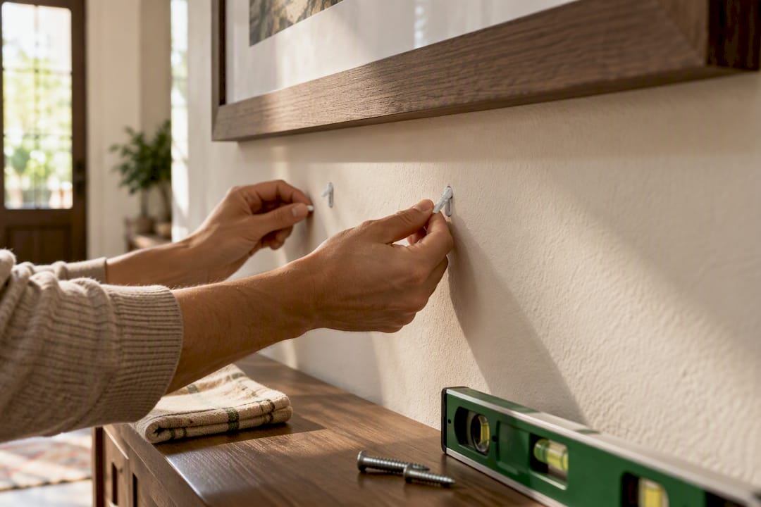
- Convert each template’s position into nail-drop coordinates, accounting for the distance between the top of the frame and where the hanging wire sits when pulled tight.
- Check top clearance and furniture clearance one more time before drilling, since paper templates have a way of revealing gaps that looked fine on a floor mockup.
- Hang the anchor piece first, then work outward from the center, checking level after every frame rather than at the end.
Pro Tip: Cut a piece of cardboard to your exact chosen gap width, say 2.5 inches, and use it as a physical spacer between frames as you hang them. It’s faster than pulling out a tape measure for every single gap, and it removes the small human error that creeps in when you’re measuring by eye after the third or fourth frame.
A few hardware notes worth knowing before you start. Wide frames, anything over 24 inches, need two anchors rather than one to stop them from tilting over time. If you’re not fully committed to a permanent arrangement, a picture ledge gives you the flexibility to rearrange without new holes at all. And if a frame has heavy moulding or a wire that sits loose rather than taut, measure the nail-drop from where the wire sits at its highest pulled point, not from the frame’s top edge. Frames with slack wire or thick moulding lips consistently hang lower than the math predicts if you skip that adjustment.
Common Gallery Wall Mistakes and How to Fix Them
Most gallery walls that look “off” aren’t victims of bad taste. They’re victims of one specific, fixable measurement problem.
- Inconsistent gaps between frames. This is the most common issue by far, and it’s usually invisible to the person who hung it because they measured “close enough” each time. Fix it by taking the whole arrangement down, measuring edge to edge with an actual spacer, and rehanging with one locked gap throughout.
- The whole composition hung too high. If your gallery wall feels like it’s floating near the ceiling, the fix isn’t moving one frame. It’s lowering the entire arrangement so the optical center actually lands at 57 to 60 inches.
- No visual anchor. A wall of same-sized frames with nothing to draw the eye first tends to feel flat. Add one dominant piece roughly twice the area of your next largest frame, and rebuild the rest of the composition outward from it.
- Too many finishes or too many identical sizes. Mixing gold, black, and white frames in one small cluster reads as clutter rather than curation. Limit yourself to two frame finishes, and vary scale so at least one or two pieces stand meaningfully larger than the rest.
Practitioner Shortcuts That Save Time and Prevent Errors
The gap between an amateur-looking gallery wall and a professional one usually comes down to a handful of small habits, not talent.
- Cut a cardboard spacer to your exact gap measurement and use it physically during install instead of re-measuring with tape every time.
- Always measure outside frame dimensions, moulding included. Forgetting the moulding is the single most common planning error, and it makes every downstream calculation slightly wrong.
- For multi-row or mixed-height layouts, decide whether interior consistency or outer symmetry matters more, then lock that variable in your spacing calculator and let the other one flex.
- Dry-run everything on the floor or with paper templates taped to the wall before a single nail goes in.
A reliable installer habit is to hang the anchor piece first, then place the largest secondary pieces, and finish with small accents, stepping back frequently to judge the outer silhouette rather than obsessing over individual gaps.
That silhouette check matters more than any single measurement. You can nail every gap perfectly and still end up with a lopsided outer shape if you never step back to look at the whole thing.
Does Frame Width and Depth Change How You Space Things?
A thin metal frame and a chunky 2 inch wooden moulding read completely differently on a wall, even at identical print sizes. Depth and width both change how much visual weight a frame carries, and that weight changes what gap looks right next to it.
Thick moulding, anything over an inch and a half wide, effectively eats into your gap visually. A 2 inch gap between two heavy wooden frames looks tighter than the same 2 inches between two thin black metal frames, because the moulding itself is competing for that visual space. When your gallery wall mixes frame styles with different moulding widths, lean toward the wider end of your gap range, closer to 3 inches, to compensate.
Depth matters for a different reason: shadow. A deep box frame or a canvas with a thick gallery wrap casts a real shadow onto the wall and onto neighboring frames, especially under angled light. That shadow can visually shrink your gap even when the physical measurement is correct. If you’re mixing flat prints with deep canvases, add a half inch to your standard gap wherever a deep piece sits next to a shallow one, just to keep the visual spacing even.
The rule of thumb: measure the gap physically, but always confirm it visually once frames are up. Moulding and depth are the two variables that make a mathematically correct gap look wrong in person.
How Should Spacing Change on Small Walls vs. Large Walls?
The 2 to 3 inch rule holds across most wall sizes, but how much of the wall you fill and how tightly you group frames should shift depending on the square footage you’re working with.
On a small wall, a narrow hallway segment or a tight stairwell landing, tighten your gaps toward the 1.5 to 2 inch end and lean into smaller frame sizes overall. A large gap on a small wall makes the arrangement look sparse and disconnected, like it’s struggling to fill space it doesn’t have. Small walls also tolerate less margin error: a 3 inch outer margin on a 40 inch wide wall reads very differently than the same margin on a 12 foot wall.
Large walls, think a great room or a two-story stairwell, can support wider gaps, 3 to 4 inches, and larger anchor pieces without feeling sparse, because there’s enough surrounding negative space to make the grouping still feel intentional. The real trap on a large wall isn’t spacing between frames. It’s spacing the entire arrangement too small relative to the wall itself, leaving it looking like an afterthought floating in a sea of empty paint.
A useful gut check: your gallery wall’s total footprint should feel proportional to the wall itself, not just to the furniture below it. On a large wall, that sometimes means adding two or three more frames than you initially planned just to keep the composition from reading as undersized.
How Do You Transition Spacing When Mixing Frame Sizes?
Mixing frame sizes is where most people either nail a gallery wall or lose it entirely, and the fix is simpler than it looks: the gap stays the same, but your visual grouping strategy has to adjust.
Keep your chosen gap, say 2.5 inches, identical between every pair of neighboring frames regardless of their individual size. The instinct to give a large frame “more breathing room” than a small one is exactly what makes mixed-size walls look disjointed. Consistency in the gap is what visually ties a 24 inch statement piece to an 8 by 10 accent print sitting right next to it.
Where size differences actually matter is in placement logic, not spacing math. Group frames of similar visual weight into loose clusters within the larger arrangement, then use your anchor piece, the largest or most dominant frame, as the gravitational center those clusters orbit around. Smaller frames tend to work best filling in corners and edges of the composition rather than sitting isolated in the middle, where their scale reads as accidental rather than intentional.
One practical transition tip: when a large frame sits directly beside a much smaller one, that size gap in visual weight can make the standard 2 to 3 inch spacing look slightly uneven even when it’s numerically correct. Nudging that specific gap up by a half inch, and only that one, often restores the visual balance without disrupting the rest of your layout’s consistency.
Can Lighting Change How Spacing Actually Looks?
Two identically measured gallery walls can look completely different depending on the light hitting them, and that’s not an illusion you can measure away with a tape measure.
Direct overhead lighting, the kind most recessed ceiling fixtures produce, casts shadows straight down from each frame’s top edge and bottom moulding lip. Those shadows can visually shrink the gap between stacked frames, making a technically correct 3 inch gap read closer to 2 inches. If your gallery wall sits under strong overhead light, err toward the wider end of your gap range to compensate for that shadow compression.
Angled or raking light, common near windows or with adjustable track lighting, throws longer shadows across the wall surface itself, which can make gaps between frames look inconsistent even when every measurement is identical. This is especially noticeable with deep frames or canvases, where the shadow cast by the frame’s depth competes visually with the actual gap next to it.
The practical fix is simple: measure your spacing during the day using the same lighting conditions the wall will actually be seen under, not under a single bright work light. If a room gets strong afternoon sun from one direction, check your arrangement again at that time before finalizing nail positions. A gap that looks perfect at noon can look uneven at 6 p.m. once shadows lengthen across the frames.
How Do You Space Shelves and Plants Within a Gallery Wall?
Shelves, hooks, small sconces, and the occasional trailing plant have become common gallery wall additions, and they follow slightly different spacing logic than frames alone.
A floating shelf inserted into a gallery wall should be treated as one unit of the composition, not a separate accessory bolted on afterward. Give it the same 2 to 3 inch clearance from neighboring frames that you’d give any other piece, measured from the shelf’s outer edge, not its mounting bracket. Shelves also need extra vertical clearance above them, typically 4 to 6 inches, since anything placed on top, a small print leaning against the wall, a candle, a plant, adds visual height that needs room to breathe.
Plants introduce a different problem: they grow. A trailing plant that sits neatly within its allotted space today can spill over a neighboring frame within a few months. Leave extra margin, at least 4 inches, around any spot where a plant will hang or sit, and reassess the arrangement seasonally if the plant is a living one rather than artificial.
The general rule for non-frame elements: they get the same spacing discipline as frames, but with slightly more generous margins to account for depth, growth, or anything sitting on top of them. Treat every shelf and plant as part of the single composition rather than an exception to it, and the gallery wall keeps reading as one intentional design rather than a frame arrangement with extras tacked on.
Arranging Devotional Gallery Walls With Purpose
A gallery wall of saints and sacred imagery carries more weight when the spacing supports it rather than competes with it. Uneven gaps or a missing focal point pull attention toward the arrangement’s flaws instead of toward the imagery itself, and that undercuts exactly what devotional art is meant to do.
Group prints by theme, patron saints tied to a particular calling, or by liturgical color, and choose one piece to serve as your anchor: a Sacred Heart image, a favored patron saint, or a Gospel scene sized larger than the rest. Build the surrounding prints outward from that anchor using one consistent gap throughout, the same 2 to 3 inch range that applies to any gallery wall. That consistency reads as reverence rather than clutter, which matters more with sacred imagery than with decorative prints.
For more on adapting these spacing principles specifically to faith-centered rooms, Divineprints has a deeper guide to gallery wall layout for devotional Christian homes worth reading before you start hanging.
Where to Find Anchor Prints for Your Devotional Gallery Wall
Once you know your spacing math, the next question is what actually fills those frames, and that’s where the anchor piece decision gets real. Divineprints carries museum-quality Saint Prints made to order on fine art paper or canvas, available across multiple sizes, which makes it straightforward to pick an anchor piece sized exactly to the two-thirds width or 57 to 60 inch center height math covered above.

If you’re building around a patron saint or a favorite Gospel scene, choose that print in the largest size your layout calls for, then work outward with smaller complementary pieces. Keeping frame finishes to two families, say a matte black and a warm wood tone, prevents the wall from competing with the prints themselves. Divineprints’ collections also include Jesus Prints and Biblical Event Prints for anyone building a mixed devotional arrangement rather than a saints-only cluster.
Start by browsing the Saint Prints collection for an anchor piece sized to your wall, then fill in the surrounding frames using the spacing rules above. Shipping is available worldwide, so the collection works whether you’re decorating a home prayer space or a parish hallway.
Arranging Sacred Art Isn’t Just Decorating. It’s Curating a Devotional Space
Here’s what most gallery wall guides miss: the spacing rules aren’t decoration advice, they’re readability rules. A consistent 2 to 3 inch gap and a properly centered arrangement aren’t about looking “put together.” They’re about making sure the eye moves through the composition the way you intend it to, landing on the anchor first and reading outward from there.
That distinction matters more for devotional art than for almost anything else you’d hang on a wall. A crooked gap between two decorative prints is a minor aesthetic miss. A crooked, unanchored arrangement of saints and sacred imagery undercuts the entire purpose of putting that imagery in the room in the first place, which is to hold attention and invite reflection rather than draw the eye toward a measurement error.
The conventional wisdom treats gallery walls as a numbers problem: hit the 57 to 60 inch center, keep a 2 to 3 inch gap, and you’re done. That’s necessary but incomplete. The overlooked piece is sequencing: which frame the eye lands on first, and whether the rest of the arrangement supports that piece or competes with it. For devotional collections especially, picking the anchor before you pick the spacing changes the entire feel of the finished wall.
— Griffin
Sources
- How to measure and plan a balanced gallery wall – Frameology
- Picture Spacing Calculator: Perfect Gallery Walls – VersaCalculator
- How to Plan a Gallery Wall: Spacing, Layout & Sizing That Actually Works – Art Academi
- Gallery Wall Layout Guide - The Decorholic
FAQ
Are Gallery Walls Outdated in 2026?
No. Gallery walls have shifted toward more curated, intentional groupings rather than disappearing, with consistent spacing and a clear anchor piece making a collection read as one cohesive artwork instead of a cluttered pile of frames.
What Are the Most Common Gallery Wall Mistakes?
The biggest ones are inconsistent gaps between frames, hanging the whole arrangement too high, and skipping a visual anchor piece to build the rest of the layout around. All three are fixable by rehanging with a single measured gap and centering the full composition at 57 to 60 inches.
What Is the 2/3 Rule for Wall Art?
The 2/3 rule means your gallery wall or art arrangement should span roughly two-thirds of the furniture’s width below it, whether that’s a sofa, console, or bed. A range of 60 to 75 percent still looks proportional, but two-thirds is the reliable middle target.
What Is the 70/30 Rule in Art?
Definitions of the 70/30 rule vary depending on the source, and it isn’t a standard gallery wall measurement rule the way the two-thirds furniture-width guideline is. Most commonly it refers to balancing dominant and secondary visual elements within a single composition rather than spacing between frames.
How Much Space Should Be Between Gallery Wall Frames?
Keep 2 to 3 inches between most frames, narrowing to 1.5 to 2 inches for small pieces and widening to 3 to 4 inches for large statement frames. The exact number matters less than applying the same gap consistently across the entire arrangement.