

Passion of Christ art depicts the events of Jesus’s final days, from the Agony in the Garden of Gethsemane through the Crucifixion and Resurrection, and every work in this tradition was made to invite both devotion and interpretation. Whether you are standing in front of a Baroque altarpiece, studying a medieval triptych panel, or choosing a print for a prayer space, knowing how to read these images changes everything.
This guide covers:
- The core Passion scenes and the visual symbols that identify them
- Major artists and representative works, from Hans Memling and Francisco de Zurbarán to Henri Matisse and Barnett Newman
- The Stations of the Cross in their traditional and modern forms
- How to read Passion imagery for both devotional and art-historical purposes
- Where to see original works in U.S. museums and churches
- How to evaluate and purchase quality reproductions
Key Takeaways
Passion of Christ art spans over a millennium of Christian visual culture, and reading it well requires both iconographic knowledge and an understanding of the devotional or liturgical context each work was made for.
| Point | Details |
|---|---|
| Know the canonical sequence | Twelve core scenes from Entry into Jerusalem to Resurrection anchor most Passion cycles and help you orient any panel or series. |
| Read the motifs | Crown of thorns, titulus, Pietà, skull at the cross, and Veronica’s veil are the fastest visual keys to identifying scenes and their theological emphasis. |
| Context shapes meaning | Original display conditions (dim monastery lighting, hinged diptych format, church procession route) were part of the work’s devotional design, not incidental. |
| Modern Stations shift the question | Matisse and Newman moved the Stations from narrative illustration to existential meditation, asking viewers to engage conceptually rather than historically. |
| Divineprints for reproductions | Divineprints offers archival-quality Jesus and Gospel-scene prints in multiple sizes and frame types, suited for home prayer spaces, parish walls, and devotional gifts. |
Table of Contents
- Why has Passion of Christ art been made for over a thousand years?
- What are the principal Passion scenes and symbols to recognize?
- Which artists and works should every viewer know?
- How do the Stations of the Cross work, and what did modern artists do with them?
- How do you actually read a Passion image?
- Where can you see Passion artworks in the U.S., and how do you choose a reproduction?
- Why Passion art still asks something of us
- Passion-themed wall art for your home or parish
- Sources
Why has Passion of Christ art been made for over a thousand years?
The short answer is function. These images were not decorations. Passion imagery in Italian and Western painting was deliberately designed to elicit pity, grief, and empathy so that worshippers could identify with Christ’s suffering and share in his exaltation. That curatorial insight from The Metropolitan Museum of Art cuts to the heart of why the tradition is so persistent: the images work on the viewer’s body as much as the mind.
The major periods each adapted that function to their own visual language:
- Medieval (roughly 900–1400): Portable diptychs and triptychs for private devotion; altarpieces for liturgical settings; narrative crowd scenes in the International Gothic style
- Renaissance (1400s–1500s): Humanized anatomy, single-point perspective, and a new interest in psychological expression
- Baroque (1600s–1700s): Dramatic chiaroscuro lighting, emotional intensity, and large-scale commissions for monasteries and confraternities
- Modern (1900s–present): Abstract, conceptual, or politically charged reinterpretations, often moving the Stations from church walls to gallery spaces
The function shifted alongside the form. A hinged portable diptych in a merchant’s bedroom served private meditation; a monumental altarpiece in a confraternity chapel served communal liturgy; a Barnett Newman canvas in a museum asks something else entirely. Regional differences matter too. Western Christian art generally emphasizes sequential narrative and iconographic detail, while Eastern Christian traditions tend toward typological imagery and different liturgical applications, with less focus on graphic suffering and more on the theological meaning of each episode.
What are the principal Passion scenes and symbols to recognize?
Most viewers encounter Passion imagery without a map. Here is the canonical sequence, roughly as it appears in the Gospels and in most multi-panel cycles:
- Entry into Jerusalem
- The Last Supper
- Agony in the Garden (Gethsemane)
- The Arrest (Betrayal by Judas)
- Trial before Pilate (and/or Herod)
- Flagellation (the Scourging)
- Crowning with Thorns
- Carrying the Cross (Via Dolorosa)
- The Crucifixion
- Deposition (Descent from the Cross)
- Entombment
- Resurrection and Post-Resurrection Appearances
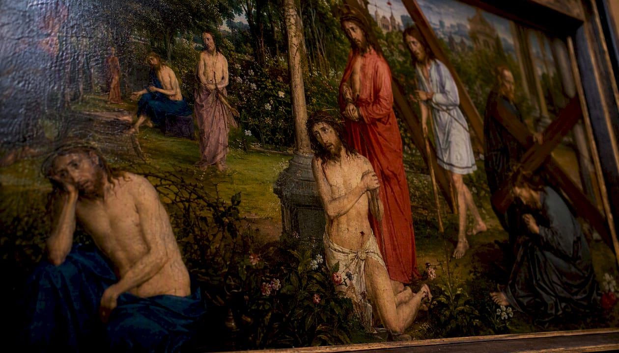
Not every work follows this order, and many compress or expand it. Hans Memling’s Scenes from the Passion of Christ distributes dozens of vignettes across a single idealized Jerusalem cityscape, mixing Passion episodes and Resurrection appearances in one continuous panel. That composite approach was a deliberate medieval device: rather than forcing the viewer through a strict sequence, it lets you contemplate the whole Passion simultaneously, moving your eye around the panel as prayer or curiosity directs.
Key recurring motifs to recognize:
- Crown of thorns: Woven from thorny branches, placed on Christ’s head during the mocking; appears in Crowning scenes and in Crucifixion images
- Nails: Typically three or four; their number was itself a theological debate (Velázquez used four)
- Veronica’s veil: A cloth bearing the imprint of Christ’s face, carried by a woman along the Via Dolorosa
- Pietà / Mary’s swoon (Spasimo): The Virgin holding the dead Christ, or collapsing in grief at the foot of the cross
- Dice and soldiers: Roman soldiers casting lots for Christ’s garments at the Crucifixion
- Titulus: The inscription “INRI” (Iesus Nazarenus Rex Iudaeorum) nailed above Christ’s head
- Wound in the side: The spear wound inflicted by the soldier Longinus, a post-death detail
- Skull at the foot of the cross: Golgotha means “place of the skull”; the skull also represents Adam, linking original sin to redemption
- Angels: Often present at the Deposition or Entombment, sometimes catching Christ’s blood in chalices
Some panels go further. A Getty collection Passion panel combines the Crucifixion with scenes of damnation and salvation, presenting a full eschatological program in a single crowded composition. When you see a panel that seems to contain more theology than narrative, look for those moral-universe symbols at the margins.
Pro Tip: When a panel seems confusing, scan for the titulus first. It anchors the Crucifixion scene, and once you locate that, you can orient the other episodes around it chronologically or spatially.
Which artists and works should every viewer know?
A handful of works appear repeatedly in museum catalogues, syllabi, and curatorial essays on this subject. Here are the ones worth knowing, with what to look for in each.
Hans Memling (Flemish, ca. 1430–1494)
Memling’s Scenes from the Passion of Christ (ca. 1470–1471, Galleria Sabauda, Turin) is the most ambitious composite Passion panel in Northern European painting. Over twenty episodes unfold across a single cityscape. The trick is to resist reading it left to right; instead, follow the figure of Christ, who appears repeatedly in different costumes and postures across the same continuous space.
Andrea di Vanni (Sienese, ca. 1332–1414)
The Scenes from the Passion of Christ triptych at the National Gallery of Art in Washington, D.C., combines the Agony in the Garden, the Crucifixion, and the Descent into Limbo across three panels. Di Vanni uses the triptych format to historicize the narrative, giving each episode its own visual weight while the gold ground unifies them devotionally. The emotive faces in the crowd scenes reward close looking.
Francisco de Zurbarán (Spanish, 1598–1664)
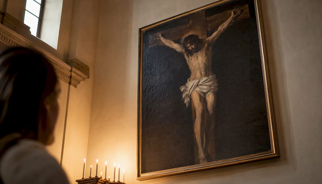
Zurbarán’s Crucifixion (1627, Art Institute of Chicago) was commissioned for a Seville monastery and installed in dim lighting. Contemporary accounts praised it for an almost sculptural presence, as if the painted figure were a real carved corpus. That effect was intentional: Baroque devotional display relied on controlled light to blur the boundary between image and object. Stand close and notice how the white loincloth glows against the dark ground.
Diego Velázquez (Spanish, 1599–1660)
Velázquez’s Crucified Christ (ca. 1632, Museo del Prado, Madrid) takes a different approach from Zurbarán’s raw drama. The figure is idealized, almost serene, reflecting Baroque court taste and a theological emphasis on Christ’s willing sacrifice rather than his agony. The Prado’s catalogue entry notes the four nails and the careful titulus, both of which were iconographic choices with theological stakes.
Henri Matisse (French, 1869–1954) and Barnett Newman (American, 1905–1970)
These two represent the modern pivot. Matisse grouped his Stations drawings into a monumental chapel-scale project at the Chapelle du Rosaire in Vence, France, where the compositions are spare, gestural, and inseparable from the ceramic tile and stained glass of the whole interior. Newman’s fourteen-part abstract series, The Stations of the Cross: Lema Sabachthani (1958–1966, National Gallery of Art), strips away every narrative marker. What remains are vertical bands of paint, asking the viewer to sit with the question Christ cried from the cross rather than to follow a story.
| Artist | Era | Medium | Standout Feature | Where to View |
|---|---|---|---|---|
| Hans Memling | Late Gothic / Flemish | Oil on panel | Composite cityscape with 20+ episodes | Galleria Sabauda, Turin |
| Andrea di Vanni | Sienese Gothic | Tempera on panel | Three-panel triptych; gold ground | National Gallery of Art, Washington, D.C. |
| Francisco de Zurbarán | Baroque | Oil on canvas | Sculptural illusionism; dim-light display | Art Institute of Chicago |
| Diego Velázquez | Baroque | Oil on canvas | Idealized anatomy; four nails | Museo del Prado, Madrid |
| Barnett Newman | Abstract Expressionist | Oil on canvas | Non-narrative; existential meditation | National Gallery of Art, Washington, D.C. |
Searching museum collections: Query any major museum’s online catalogue with the artist’s name plus “Passion” or “Crucifixion.” The Met, the NGA, and the Art Institute of Chicago all publish detailed provenance and exhibition histories alongside their collection entries, which is exactly the kind of curatorial scholarship that helps you distinguish a devotional commission from a gallery piece.
How do the Stations of the Cross work, and what did modern artists do with them?
The Stations of the Cross are a devotional sequence tracing fourteen moments from Christ’s condemnation to his burial, traditionally displayed as a series of images or sculptures around the interior walls of a church. Worshippers move from station to station in prayer, physically enacting a pilgrimage to Jerusalem. The number fourteen became standard in Western practice by the eighteenth century, though earlier versions varied widely depending on the tradition and patron.
The format is inherently sequential and participatory, which is precisely what made it attractive to modern artists looking for a structure they could subvert.
Traditional vs. modern Stations: key contrasts
| Dimension | Traditional (church setting) | Modern reinterpretation |
|---|---|---|
| Purpose | Devotional pilgrimage; liturgical prayer | Conceptual meditation; gallery experience |
| Viewer engagement | Physical movement through space; communal prayer | Contemplative viewing; individual response |
| Representation | Narrative figuration; identifiable scenes | Abstract, gestural, or symbolic imagery |
| Typical setting | Church interior walls | Chapel, gallery, or public space |
Matisse’s Stations at Vence are monumental and gestural; the figures are barely sketched, yet the sequence carries an unmistakable emotional weight. Newman’s Lema Sabachthani series goes further, removing figures entirely. The title, Christ’s cry of desolation from the cross, becomes the subject of the work rather than a caption for it.
The Yale ISM Review’s critical essay on the Stations argues that contemporary art has positioned these works between liturgy and gallery, changing how viewers engage with them. That boundary-crossing is the point. When Asco, the East Los Angeles Chicano art collective, performed their own Stations of the Cross as a political street action in 1971, they were using the devotional structure to make a claim about suffering and community that had nothing to do with church walls and everything to do with the streets of East L.A.
Modern artists often move the Stations from narrative illustration to present-tense critique, shifting viewer engagement from historical empathy to contemporary questioning. That shift is worth holding in mind when you encounter abstract or politically charged stations art: the question is not “what happened?” but “what does this mean now?”
How do you actually read a Passion image?
Whether you are in a museum gallery, a parish church, or looking at a reproduction at home, a short sequence of questions will get you further than any amount of background reading alone.
- Identify the subject. Which episode is depicted? Use the iconographic markers above (titulus, crown of thorns, cross, number of figures) to locate the scene in the Passion sequence.
- Read the context and provenance. Where was this made, for whom, and where was it originally displayed? A monastery commission differs from a private devotional panel in almost every visual decision.
- Check the composition and lighting. Where does the eye go first? Baroque artists used light as a theological argument, directing attention to Christ’s body or face. Medieval artists used gold ground to signal sacred space outside ordinary time.
- Ask about function. Was this made for communal liturgy, private prayer, or public display? The Cleveland Museum’s portable diptych was hinged so an owner could open it for focused meditation, a physical ritual that shaped how the image was experienced.
- Look for what is unusual. Extra figures, unusual iconography, or scenes that do not fit the standard sequence often signal a specific patron’s theology, a local devotional tradition, or a later addition.
- Shift between lenses. Ask the devotional question first: how does this image invite empathy or prayer? Then ask the analytical question: what compositional or material choices produce that effect?
Pro Tip: Curators advise paying close attention to original display conditions. Zurbarán’s Crucifixion was meant to be seen in near-darkness; in a bright museum gallery, it reads differently than it was designed to. When a label mentions the original setting, use that information to mentally reconstruct the viewing experience.
Art historians note that tradition and innovation coexist in Passion art: artists consistently use established iconography while renewing expression through light, realism, or abstraction to provoke direct viewer engagement. That tension is what keeps the tradition alive across centuries.
Questions for class discussion or private devotion:
- What emotion does the artist seem to want you to feel, and how is that produced technically?
- Who is absent from this scene that you would expect to see?
- If this image were displayed in its original setting, how would the architecture and light change your experience of it?
Where can you see Passion artworks in the U.S., and how do you choose a reproduction?
U.S. institutions with significant holdings
Several American museums hold major works or run relevant exhibitions:
- National Gallery of Art (Washington, D.C.): Holds Andrea di Vanni’s Passion triptych and Barnett Newman’s Stations of the Cross series
- Art Institute of Chicago: Holds Zurbarán’s Crucifixion (1627)
- The Metropolitan Museum of Art (New York): Extensive holdings in medieval and Renaissance religious art, with strong curatorial essays available online
- The Cloisters (New York, a branch of the Met): Specializes in medieval European art, including altarpieces and devotional panels
- Smithsonian American Art Museum (Washington, D.C.): Holds documentation of Asco’s Stations of the Cross performance
For parish and church visits, Passion cycles are most prominently displayed during Lent and Holy Week. Many Catholic parishes display Stations of the Cross year-round on interior walls. Call ahead to ask about viewing access outside of Mass times; most parishes welcome visitors for quiet viewing.
Choosing a quality reproduction
When buying a Passion-themed print or canvas, these are the factors that separate a lasting piece from a faded disappointment:
- Print resolution: Look for files printed at 300 ppi or higher; anything lower will show visible pixelation at standard wall-art sizes
- Paper vs. canvas: Archival cotton rag paper suits framed prints; canvas works well for larger, unframed or gallery-wrapped pieces
- Color profiling: Adobe RGB captures a wider gamut than sRGB and is preferable for reproductions of paintings with rich, complex tones
- Archival inks: Pigment-based inks resist fading significantly longer than dye-based inks
- Framing: For liturgical spaces, simple dark wood or gilded frames echo the historical context; for home settings, a clean white or natural wood frame keeps the image prominent
For guidance on integrating devotional prints into a home setting, the Christian artwork for your home guide at Divineprints covers placement, scale, and framing in practical terms.
Licensing and provenance: Museum reproduction shops (the Met Store, the NGA Shop) license images directly from their collections, which means the color calibration is done against the original. For independently produced prints, ask the seller whether the source image is licensed and what resolution the print file was prepared at. A seller who cannot answer those questions is worth skipping.
Why Passion art still asks something of us
There is a tendency in art history courses to treat Passion imagery as a solved problem: identify the iconography, note the period, move on. That approach misses what makes these works genuinely difficult. A Zurbarán Crucifixion in a dim monastery was not just a picture of an event; it was an object designed to collapse the distance between the viewer and the moment of Christ’s death. The painting was supposed to make you feel like you were there.
That ambition did not disappear with the Baroque. Newman’s Lema Sabachthani series asks the same question in a completely different visual language: what does it mean to be present to suffering you cannot fix? The abstract canvases offer no narrative comfort, no identifiable figure to project onto. They just hold the question open.
What strikes me about the best Passion art, across every period, is that it refuses to be merely illustrative. The medieval composite panels, the Baroque chiaroscuro, the gestural modern Stations all share one quality: they demand something from the viewer. You cannot just look. You have to decide what you are looking at and why it matters. That is as true for a student writing a paper on Memling as it is for a parishioner walking the Stations on Good Friday. The image is always asking you to bring yourself to it.
Divineprints publishes this guide as part of its commitment to faith-centered art education for Christian and Catholic communities.
Passion-themed wall art for your home or parish
If this guide has you thinking about living with Passion imagery rather than just studying it, the practical question is where to start.
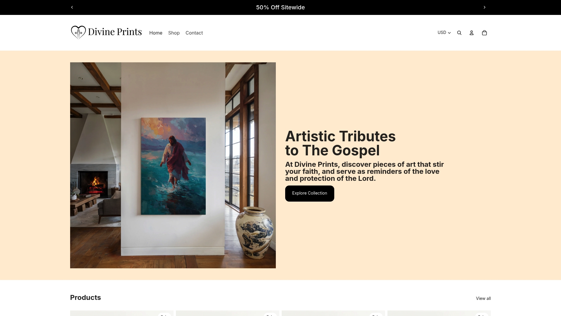
Divineprints offers museum-grade fine art prints and canvases of devotional Jesus-themed imagery, printed with archival pigment inks on archival-quality substrates and available in multiple sizes and frame types. The Sacred Heart of Jesus print is a strong starting point for a prayer space or bedroom wall: the image is devotionally rich, the color reproduction is calibrated for accuracy, and the framing options suit both traditional and contemporary interiors. For a Gospel-scene reproduction with a more painterly, museum-style feel, the Transfiguration of Jesus shows what archival canvas printing can do with complex tonal ranges.
For scale, a 16×20 inch print works well as a focal point in a home prayer corner; larger canvases (24×36 inches and up) hold their own on a parish or classroom wall. Matte finishes reduce glare in candlelit or low-light liturgical settings; a semi-gloss finish brings out color depth in well-lit rooms. Browse the full collection at Divineprints to find the size, finish, and framing that fits your space.
Sources
These sources underpin the claims and examples throughout this guide. Museum essays are the best starting point for provenance and close visual analysis; the Yale ISM Review piece is the most useful for understanding modern reinterpretations.
- The Crucifixion and Passion of Christ in Italian Painting
- Rereading the Stations of the Cross Through Art – The Yale ISM Review
- The Crucifixion
- Scenes from the Passion of Christ: The Agony in the Garden, the Crucifixion, and the Descent into Limbo entire triptych
- Diptych with the Passion of Christ | Cleveland Museum of Art